
Advanced Flutter TextField Techniques Used in Production Apps

When you first start learning Flutter, creating a text box feels a bit like magic. You drop a TextField widget onto your screen, and boom—your user can type! It is an awesome milestone for any beginner.
But as you start moving from basic practices to building real-world apps, you quickly notice that just letting someone type isn’t always enough.
Think about your favorite apps. When you open a chat screen, the typing box automatically grows taller when you type a long message. When you open a login page, the keyboard pops up right away without making you tap the field. And when you type a verification code, the cursor instantly jumps to the next box all by itself.
To make your app feel smooth, professional, and friendly, you need to teach your inputs how to behave intelligently.
If you have already looked at our Ultimate Guide to Flutter TextFields, you know how to read text using controllers. If you have explored our guide on Flutter TextField Customization, you know how to use isDense to style them beautifully without fighting InputDecoration.
In this post, we are going to step past those basics. You will learn how to listen to inputs in real-time, handle multi-line layouts safely, manage focus, and build the exact input experiences that production apps use every day.
Detecting Text Changes in Real-Time
When a user types inside your app, you often need to know exactly what they are entering the moment they type it.
Think of a search bar that filters a list with every single keystroke, or a password field that checks if the input is long enough while the user is still typing.
In Flutter, you have two primary ways to listen to these changes: a quick way and a structured way.
Method 1: The Quick Way (onChanged)
The absolute simplest way to see what a user is typing is by using the onChanged property directly on your TextField.
Whenever the user adds or deletes a character, this callback triggers and hands you the fresh string:
TextField(
  onChanged: (text) {
    print("The user typed: $text");
    // You can update your UI state or filter a list right here!
  },
)
When to use onChanged:
Quick, real-time lookups (like basic search filters).
Simple character counters (e.g., showing “12/50 characters”).
Enabling or disabling a button based on whether the field is empty.
Method 2: The Structured Way (TextEditingController)
While onChanged is great for a quick look, it has a limitation: it only tells you what changed inside the widget.
If you want to clear the text box with a button, set an initial value, or listen to the text from outside the TextField, you need a controller.
As we discussed in our foundational Flutter TextField Guide, you should always create your controller inside initState and dispose of it in the dispose method to keep your app lag-free.
To listen to changes using a controller, you attach a listener in your initState:
class _HomeScreenState extends State<HomeScreen> {
final TextEditingController _myController = TextEditingController();
@override
void initState() {
super.initState();
// Start listening to text changes
_myController.addListener(_printLatestValue);
}
@override
void dispose() {
// Always clean up the controller when the widget is removed
_myController.dispose();
super.dispose();
}
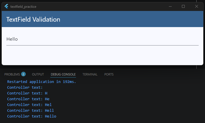
void _printLatestValue() {
print("Controller text: ${_myController.text}");
}
@override
Widget build(BuildContext context) {
final theme = Theme.of(context);
return Scaffold(
appBar: AppBar(
title: const Text('TextField Validation'),
backgroundColor: theme.colorScheme.primary,
foregroundColor: theme.colorScheme.onPrimary,
),
body: Padding(
padding: const EdgeInsets.all(16),
child: Column(
children: [
TextField(
controller: _myController,
),
],
),
),
);
}
}
When to use a Controller Listener:
You need to read the text value from multiple places in your code.
You need to manipulate the text programmatically (like auto-formatting a phone number as the user types).
A Quick Performance Reminder: Whether you use
onChangedor a listener, running heavy logic or callingsetState()on every single keystroke can slow your app down.If you are validating user input, make sure to read our Flutter Form Validation Guide to see how to handle errors cleanly without hurting your app’s performance.
Using onChanged Effectively
Now that you know how to capture text changes, let’s talk about how to use onChanged in real-world scenarios.
It is one of the most powerful properties on a TextField, but if it isn’t used carefully, it can easily slow down your app or cause a choppy user experience.
The Trap: Real-Time API Searches
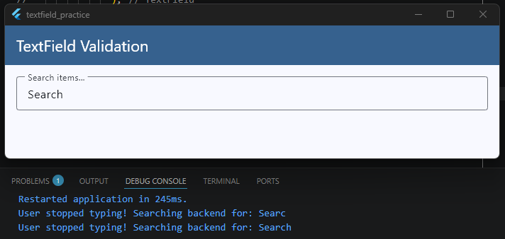
Imagine you are building a search bar for a movie app. If a user types “Spiderman”, onChanged will trigger 9 separate times—once for “S”, once for “Sp”, once for “Spi”, and so on.
If you trigger a network API call inside onChanged immediately, your app will send 9 separate backend requests in less than two seconds!
This wastes mobile data, drains the battery, and can cause old search results to pop up over new ones if the network responses arrive out of order.
To handle this effectively, you need a technique called Debouncing. Debouncing means waiting until the user stops typing for a brief moment (like 500 milliseconds) before running your heavy logic or API search.
Putting It All Together
Let’s look at exactly how we integrate this debouncing logic into our core _HomeScreenState example so you can see the whole picture:
import 'dart:async'; // 1. Don't forget to import this at the very top of your file!
import 'package:flutter/material.dart';

class HomeScreen extends StatefulWidget {
  const HomeScreen({super.key});

  @override
  State<HomeScreen> createState() => _HomeScreenState();
}

class _HomeScreenState extends State<HomeScreen> {
  // 2. Define the timer variable inside your State class
  Timer? _debounceTimer;

  // 3. Create the function that handles the timing logic
  void _onSearchChanged(String query) {
    // Cancel the previous timer if the user types another character before 500ms
    if (_debounceTimer?.isActive ?? false) _debounceTimer!.cancel();

    // Start a fresh 500ms countdown
    _debounceTimer = Timer(const Duration(milliseconds: 500), () {
      print("User stopped typing! Searching backend for: $query");
      // This is where you would call your API or filter your list safely
    });
  }

  @override
  void dispose() {
    // 4. Always cancel your timers when the widget is destroyed to prevent memory leaks!
    _debounceTimer?.cancel();
    super.dispose();
  }

  @override
  Widget build(BuildContext context) {
    final theme = Theme.of(context);

    return Scaffold(
      appBar: AppBar(
        title: const Text('TextField Validation'),
        backgroundColor: theme.colorScheme.primary,
        foregroundColor: theme.colorScheme.onPrimary,
      ),
      body: Padding(
        padding: const EdgeInsets.all(16),
        child: Column(
          children: [
            TextField(
              // 5. Pass your function directly to onChanged
              onChanged: _onSearchChanged,
              decoration: const InputDecoration(
                labelText: 'Search items...',
                border: OutlineInputBorder(),
              ),
            ),
          ],
        ),
      ),
    );
  }
}
Key Takeaways for this Setup
The State Class Level: We declare
_debounceTimerat the top of our state class so the app can remember and track the active countdown across multiple keystrokes.The
onChangedLink: Every time a new letter is typed, Flutter calls_onSearchChanged. It immediately kills the old countdown timer and spins up a brand new 500-millisecond countdown.The
disposeCleanup: Just like clearing out text controllers, it is best practice to call_debounceTimer?.cancel()inside yourdispose()method so background timers don’t keep running if the user leaves the screen.
Validation Tip: While
onChangedis amazing for tracking keystrokes, using it to show aggressive error messages (like flashing “Invalid Email” the second someone types their first letter) can frustrate users. If you want to see how to structure error handling properly with better timing, take a look at our complete Flutter Form Validation Guide.
Handling Focus Events
Have you ever opened an app and noticed that the keyboard instantly popped up, ready for you to type? Or have you noticed how a text field’s border changes color the exact moment you tap inside it?
All of this is controlled by Focus. Knowing how to manage focus allows you to control which input field is active, when the keyboard should appear, and how your app responds when a user interacts with different parts of the screen.
In Flutter, we manage this using a class called a FocusNode.
What is a FocusNode?
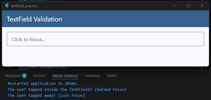
Think of a FocusNode as an invisible manager assigned to a specific widget. It keeps track of whether that widget is currently highlighted (has focus) or ignored (lost focus).
Let’s look at how to add a FocusNode to our core _HomeScreenState example to see how it works in practice:
class _HomeScreenState extends State<HomeScreen> {
  // 1. Create the FocusNode instance
  final FocusNode _myFocusNode = FocusNode();

  @override
  void initState() {
    super.initState();
    // 2. Add a listener to detect when focus changes
    _myFocusNode.addListener(_onFocusChange);
  }

  @override
  void dispose() {
    // 3. Always clean up FocusNodes to prevent memory leaks!
    _myFocusNode.removeListener(_onFocusChange);
    _myFocusNode.dispose();
    super.dispose();
  }

  void _onFocusChange() {
    if (_myFocusNode.hasFocus) {
      print("The user tapped inside the TextField! (Gained Focus)");
    } else {
      print("The user tapped away! (Lost Focus)");
    }
  }

  @override
  Widget build(BuildContext context) {
    final theme = Theme.of(context);

    return Scaffold(
      appBar: AppBar(
        title: const Text('TextField Validation'),
        backgroundColor: theme.colorScheme.primary,
        foregroundColor: theme.colorScheme.onPrimary,
      ),
      body: Padding(
        padding: const EdgeInsets.all(16),
        child: Column(
          children: [
            TextField(
              // 4. Attach the FocusNode to your TextField
              focusNode: _myFocusNode,
              decoration: const InputDecoration(
                labelText: 'Click to focus...',
                border: OutlineInputBorder(),
              ),
            ),
          ],
        ),
      ),
    );
  }
}
Real-World Focus Tricks
Once you have a FocusNode attached, you can do some really cool things to improve your app’s user experience:
1. Autofocus on Screen Load
If you want the keyboard to open automatically the split-second a screen opens (like a search screen), you don’t even need a controller setup. Just set autofocus: true on your widget:
TextField(
  autofocus: true,
)
2. Requesting Focus Programmatically
If you want to force the cursor to jump into a specific text box after a user clicks a button, you can use your custom node:
ElevatedButton(
  onPressed: () {
    // This tells Flutter to instantly open the keyboard and highlight our field
    _myFocusNode.requestFocus();
  },
  child: const Text('Focus Input Field'),
)
3. Unfocusing (Hiding the Keyboard)
Sometimes, when a user scrolls down a page or taps empty space on the screen, you want the keyboard to slide away. You can remove focus like this:
_myFocusNode.unfocus();
Managing focus properly prevents your users from constantly having to manually tap tiny text boxes on their screens.
If you want to dive deeper into styling changes when a field becomes active, jump over to our Flutter TextField Customization Guide where we explore setting up unique focusedBorder states.
Working with onSubmitted
When a user finishes typing into an input field—like entering a search keyword or filling out a password—their natural instinct is to tap the action button at the bottom right corner of their mobile keyboard.
Depending on the situation, that button might say Done, Search, Go, or Next.
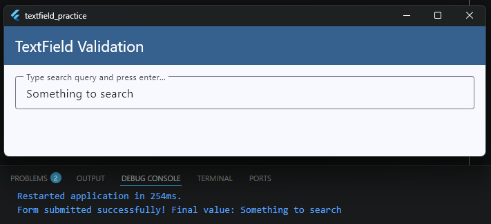
In Flutter, the onSubmitted property is a callback that triggers the exact moment a user taps that keyboard action button. It gives you direct access to the final text value so you can immediately process it.
Integrating onSubmitted Into Our Example
Let’s look at how to wire up onSubmitted inside our core _HomeScreenState example to handle a clean form submission:
class _HomeScreenState extends State<HomeScreen> {
  // A helper function to handle the final text submission
  void _handleSubmit(String finalValue) {
    // Trim any accidental whitespace typing errors
    final cleanValue = finalValue.trim();

    if (cleanValue.isEmpty) {
      print("Cannot submit an empty field!");
      return;
    }

    print("Form submitted successfully! Final value: $cleanValue");
    // This is the perfect spot to trigger your login API,
    // database save, or route navigation logic!
  }

  @override
  Widget build(BuildContext context) {
    final theme = Theme.of(context);

    return Scaffold(
      appBar: AppBar(
        title: const Text('TextField Validation'),
        backgroundColor: theme.colorScheme.primary,
        foregroundColor: theme.colorScheme.onPrimary,
      ),
      body: Padding(
        padding: const EdgeInsets.all(16),
        child: Column(
          children: [
            TextField(
              // 1. Change the visual look of the keyboard button
              textInputAction: TextInputAction.search,

              // 2. Pass your submission handler function
              onSubmitted: _handleSubmit,

              decoration: const InputDecoration(
                labelText: 'Type search query and press enter...',
                border: OutlineInputBorder(),
              ),
            ),
          ],
        ),
      ),
    );
  }
}
Controlling the Keyboard Style (textInputAction)
By default, Flutter decides which button icon to show on the virtual keyboard. However, you can explicitly control this using the textInputAction property to match your app’s exact user experience context:
TextInputAction.search: Changes the button to a magnifying glass icon or a “Search” label. Ideal for search bars.TextInputAction.done: Changes the button to a checkmark or “Done”. Closes the virtual keyboard automatically when tapped.TextInputAction.next: Changes the button to a right-facing arrow or “Next”. Great for moving the cursor from an email field straight down into a password field.
Using onSubmitted alongside a thoughtful textInputAction keeps your users moving through your app smoothly without forcing them to manually dismiss the keyboard overlay.
Validation Note: If you are using
onSubmittedto trigger a final check across multiple input fields at once, you might find a traditionalFormwidget easier to manage.Head over to our Flutter Form Validation Guide to see how to bundle inputs together for clean, complete validation flows.
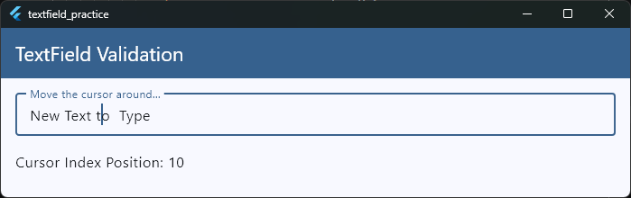
Getting the Cursor Position
Have you ever wondered how advanced apps insert text exactly where your cursor is currently sitting?
For example, if you are building a chat app or a text editor, and the user taps an emoji button, you don’t want that emoji to blindly drop at the very end of the text. You want it to appear exactly where they are currently typing.
To achieve this level of control, we need to inspect a hidden property inside our TextEditingController called value (which is a TextEditingValue object).
Understanding TextEditingValue
The TextEditingValue object holds three important pieces of information about what is happening inside your TextField:
text: The actual string of characters currently typed.selection: Where the cursor is sitting, or what range of text is currently highlighted by the user.composing: The text range currently being handled by the operating system’s keyboard (like active auto-correct suggestions).
To find the exact location of the cursor, we look at selection.baseOffset. This gives us an index number representing exactly how many characters into the text the cursor is currently placed.
Integrating Cursor Tracking into Our Example
Let’s look at how to read the cursor position inside our core _HomeScreenState example. We will use a listener on our controller to read the position dynamically as the user moves around or types:
class _HomeScreenState extends State<HomeScreen> {
  // 1. Create your controller
  final TextEditingController _myController = TextEditingController();
  int _currentCursorIndex = 0;

  @override
  void initState() {
    super.initState();
    // 2. Listen to controller updates (this fires on text changes AND cursor moves)
    _myController.addListener(_updateCursorPosition);
  }

  @override
  void dispose() {
    // 3. Clean up the controller
    _myController.dispose();
    super.dispose();
  }

  void _updateCursorPosition() {
    setState(() {
      // 4. Read the baseOffset to get the current cursor index position
      _currentCursorIndex = _myController.selection.baseOffset;
    });
  }

  @override
  Widget build(BuildContext context) {
    final theme = Theme.of(context);

    return Scaffold(
      appBar: AppBar(
        title: const Text('TextField Validation'),
        backgroundColor: theme.colorScheme.primary,
        foregroundColor: theme.colorScheme.onPrimary,
      ),
      body: Padding(
        padding: const EdgeInsets.all(16),
        child: Column(
          crossAxisAlignment: CrossAxisAlignment.start,
          children: [
            TextField(
              controller: _myController,
              decoration: const InputDecoration(
                labelText: 'Move the cursor around...',
                border: OutlineInputBorder(),
              ),
            ),
            const SizedBox(height: 16),
            // Display the position to the user
            Text(
              'Cursor Index Position: $_currentCursorIndex',
              style: theme.textTheme.bodyLarge,
            ),
          ],
        ),
      ),
    );
  }
}
Practical Use Case: Inserting Text at Cursor Position
Knowing the index is great, but how do you use it? Here is a quick example of a function that inserts a specific string (like an emoji) exactly where the cursor is sitting, then puts the cursor right back after the new text:
void _insertEmoji(String emoji) {
  final text = _myController.text;
  final selection = _myController.selection;

  // Find the cursor position (default to 0 if nothing is selected)
  int start = selection.start;
  if (start < 0) start = 0;

  // Insert the emoji string into the original text
  final newText = text.substring(0, start) + emoji + text.substring(start);

  // Update the controller with the new text and set the new cursor position
  _myController.value = TextEditingValue(
    text: newText,
    selection: TextSelection.collapsed(offset: start + emoji.length),
  );
}
By mastering TextEditingValue, you step out of basic form inputs and start unlocking the power required to build custom document editors, markdown parsers, or custom chat interfaces.
Multi-line TextFields
By default, a TextField in Flutter is built to handle a single line of text. If you keep typing past the edge of the screen, the text simply slides to the left, disappearing out of view.
While this is exactly what you want for an email or password field, it completely breaks the user experience if you are building a bio page, a notes app, or a chat input field. For those features, you want a box that wraps text naturally and grows taller as the user types more content.
Expanding TextFields Automatically
Let’s look at how to easily turn our core _HomeScreenState example into a dynamic, expanding text area:
class _HomeScreenState extends State<HomeScreen> {
  @override
  Widget build(BuildContext context) {
    final theme = Theme.of(context);

    return Scaffold(
      appBar: AppBar(
        title: const Text('TextField Validation'),
        backgroundColor: theme.colorScheme.primary,
        foregroundColor: theme.colorScheme.onPrimary,
      ),
      body: Padding(
        padding: const EdgeInsets.all(16),
        child: Column(
          children: [
            TextField(
              // 1. Tell the keyboard to optimize for long paragraphs
              keyboardType: TextInputType.multiline,

              // 2. Set the starting height constraint
              minLines: 1,

              // 3. Allow it to grow dynamically as lines are added
              maxLines: 5,

              decoration: const InputDecoration(
                labelText: 'Type your message or notes here...',
                alignLabelWithHint:
                    true, // Keeps the label at the top left corner
                border: OutlineInputBorder(),
              ),
            ),
          ],
        ),
      ),
    );
  }
}
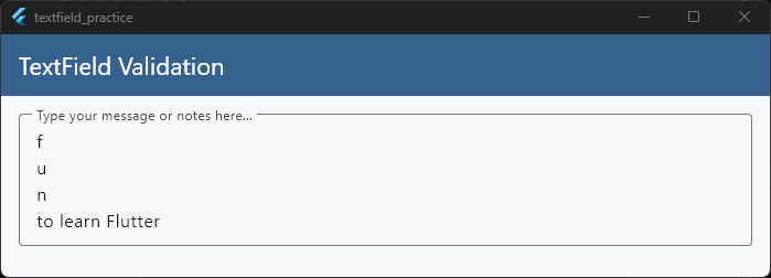
Understanding the Line Constraints
To control how your multi-line field behaves, you need to configure three primary parameters:
keyboardType: TextInputType.multiline: This changes the layout of the virtual keyboard so that the bottom-right action button acts as a physical “Enter” key, allowing users to create line breaks instead of accidentally submitting the form.minLines&maxLines: SettingminLines: 1andmaxLines: 5means the input box will start out small. If the text hits the edge of the screen, it wraps downwards, growing taller until it reaches exactly 5 lines high. If the user keeps typing past that point, the box stops growing and safely turns into an internal scrolling box.The Infinite Growth Trick: If you want a notes tool or text editor where the field grows forever without any restrictions, set
maxLines: null.
Ready to Build Real-World App Features?
Learning to control layouts, handle complex user input states, and link them to responsive interfaces is exactly what shifts you from a beginner to a confident app developer.
If you want to stop piecing together snippets and start building complete production-ready apps from scratch—including dynamic chat interfaces, authentication flows, and full multi-screen architectures—join us inside the Flutter Foundations Course.


